Role: Motion and Graphic Designer
Agency: Flourish. https://flourish.agency/
Role: Animation only.
A series of logo animations produced for some of Flourish’s many clients.
Role: Design, layout and animation. (Sole designer).
Role: Design, layout and animation (sole designer).
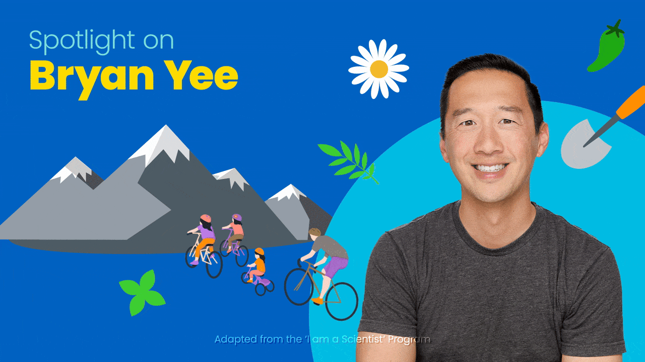
Role: Copywriter, Graphic and Motion Designer
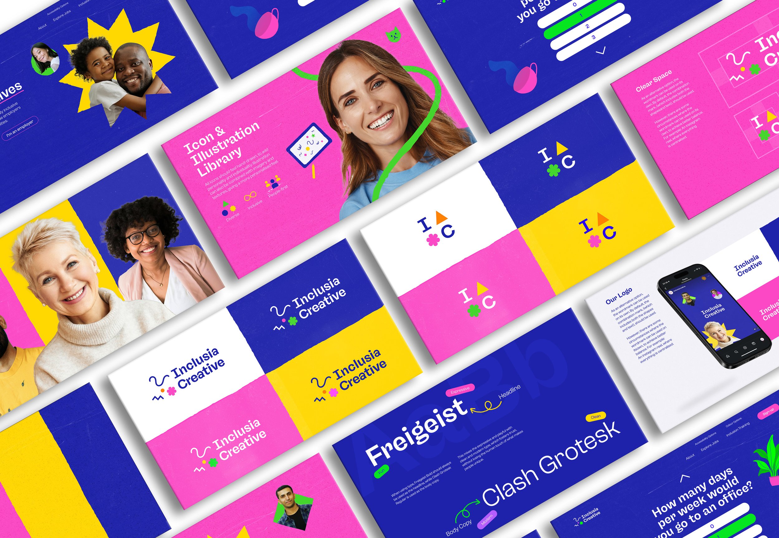
Role: Sole Brand Designer
Role: Design and layout
Agency: Substance Global
Client: Amgen
Agency: Substance Global
Role: Graphic and Motion Designer
Various static and motion posts produced for Amgen and The Amgen Foundation on behalf of Substance Global, with some video editing also involved.
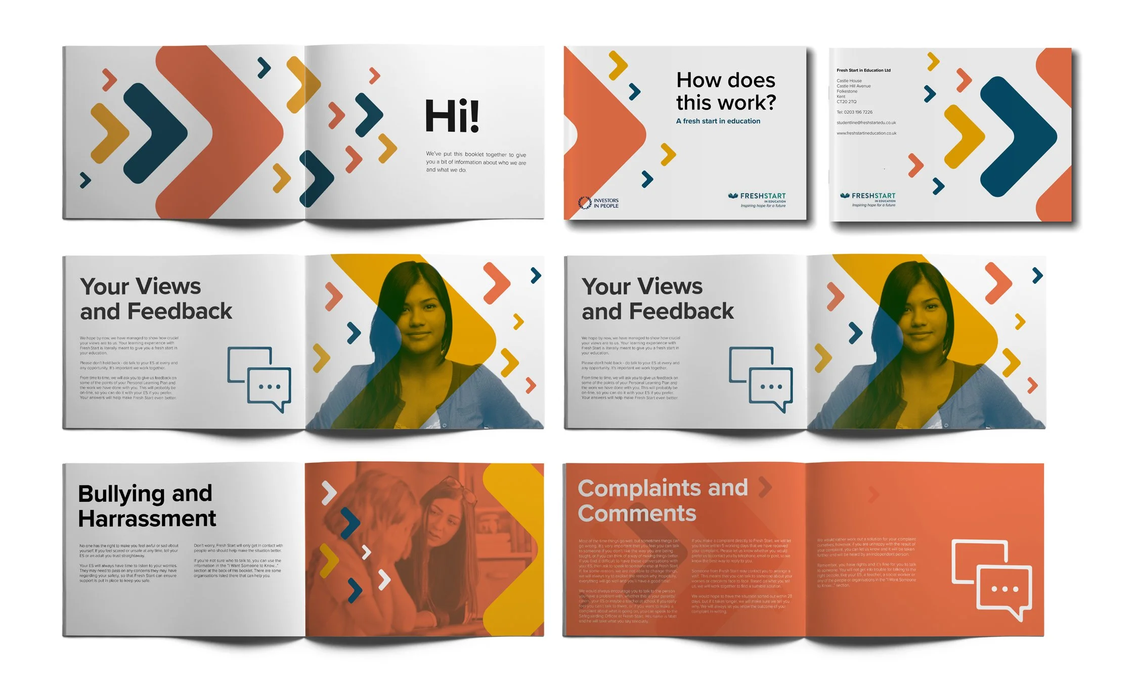
Agency: Angle Studios
Role: Print Designer
Helping to support students facing challenges in gaining access to education and entering the workplace, Fresh Start
asked Angle Studios to design a brochure, which would act as a student guide for those who study with Fresh Start in Education.
With the target audience being students of all ages, Fresh Start campaigns for positive change, with vibrant colours, imagery and arrows symbolising moving forwards, which can be seen throughout the whole brochure.
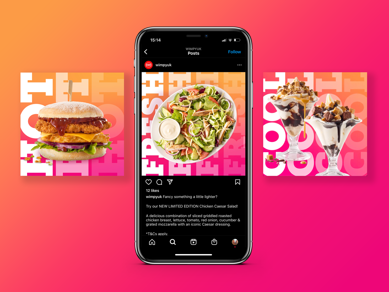
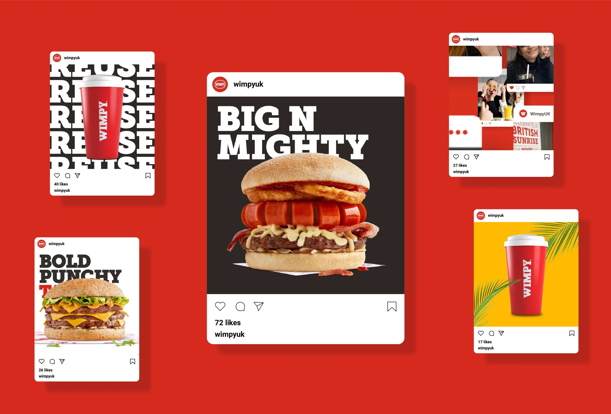
Role: Graphic & Motion Designer, with the exception of the ‘Find Your Wimpy’ and ‘Wrap & Roll’ posts, which are motion design only.
Agency: Latch